
TLDR
Start by listing every token and emblem your deck can create, including the weird ones.
Build one consistent “visual language” so your board state looks intentional, not like a lost-and-found bin.
Prioritize readability over artistry. Your friends should not need binoculars to know what your token does.
For emblems, print the full emblem text. Your memory is not a rules engine.
Use a repeatable checklist so you stop reinventing the wheel every time you change commanders.
Your deck does a lot of things. It ramps, it draws, it “accidentally” makes twelve tokens, and then it asks the table to remember what those tokens are. That last part is where custom MTG tokens and emblems quietly save your game night. Not because they are flashy, but because they prevent the classic mid-turn question: “Wait, what is that little upside-down coin supposed to be?”
This post helps MTG players who love brewing and tweaking design custom tokens and emblems that match their deck’s theme, so the board stays clear and your deck looks like it has a personality on purpose.
Why bother matching tokens and emblems to your deck
Tokens are not optional in modern Magic. They are basically a secondary card type stapled onto half the set.
When your tokens match your deck, you get three real benefits:
1) Faster games
Clear tokens reduce pauses. Pauses reduce misplays. Misplays reduce “I would have won if…” speeches.
2) Cleaner board states
If your Treasure token looks like your Zombie token except it is “kind of shinier,” you are one distracted moment away from tapping the wrong thing and blaming your sleeves.
3) The deck feels cohesive
A tight token package makes your deck feel like a finished build, not a list you assembled at 1 a.m. while whispering “this seems fine” at your screen.
Tokens vs emblems, quick definitions you actually need
You do not need to read the Comprehensive Rules for fun. You just need the two concepts straight.
Tokens
A token is a game object used to represent a permanent that is not represented by a card. Tokens behave like permanents and interact with the game normally while on the battlefield. Tokens also have a few rules quirks worth remembering (like what happens when they leave the battlefield).
Practical takeaway: your token needs to clearly show what it is, because it is going to behave like a real thing.
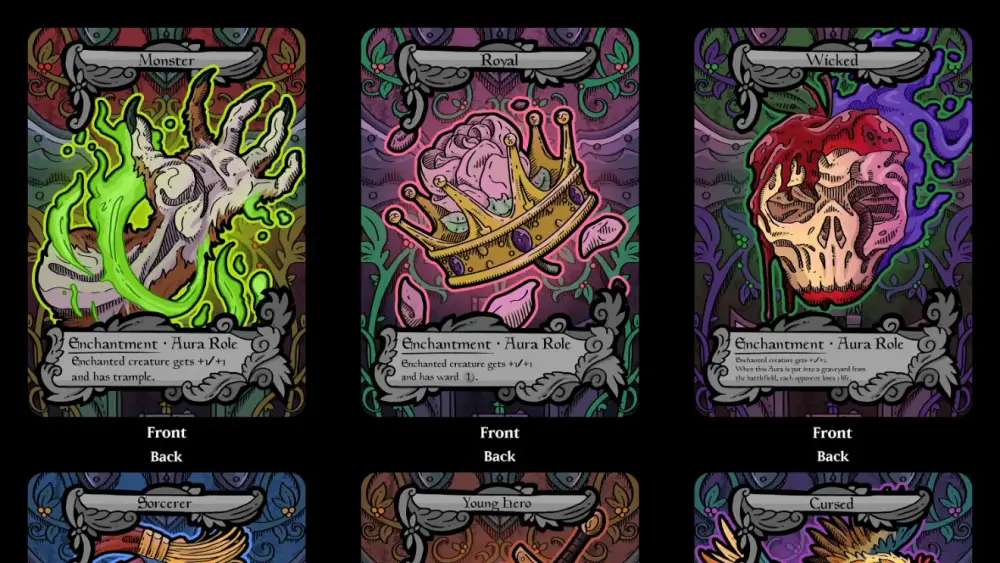
Emblems
An emblem is a marker that represents an object with one or more abilities, usually created by planeswalkers. Emblems live in the command zone, and their abilities function from there. They are not permanents, and they are not cards.
Practical takeaway: emblems are basically “rules stickers” for the game, except you cannot peel them off when you regret your choices.
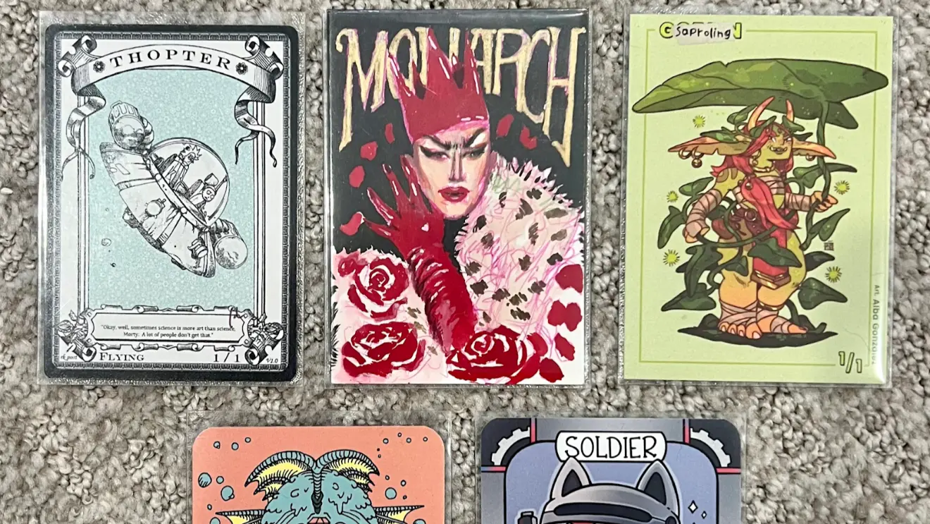
Step 1: Build your token and emblem list
Before you open a design program (or a marker), do inventory. This is the step most people skip, which is why they have gorgeous Zombie tokens and then use a penny for “one random Clue.”
The Token Package Worksheet
For each token your deck can make, write down:
Name (Zombie, Treasure, Clue, Copy of a creature, etc.)
Type line (Creature, Artifact, Enchantment, Aura Role, and so on)
Power/toughness (if it is a creature)
Rules text (especially for predefined tokens like Treasure and Clue)
Quantity pattern
“One at a time”
“Makes a pile”
“Goes wide suddenly”
Tracking needs
Needs to tap
Gains counters a lot
Transforms
Copies other creatures
Then do the same for emblems:
Source planeswalker
Full emblem text
Anything you always forget (which is usually the important part)
Don’t forget the “predefined token” trap
A bunch of tokens in MTG have defined rules text baked into the rules (Treasure, Food, Clue, Blood, Powerstone, and more). If your custom token does not show the relevant ability, you are relying on everyone’s memory. That is bold. Also incorrect a surprising amount of the time.
If your deck makes these tokens, include their rules text on the token. You are designing for play, not for vibes.
Step 2: Choose a visual language that stays consistent
This is the part where you decide what your deck “looks like.”
Pick a style guide, then stick to it:
Frame style: retro, modern, full art, sketchy, minimalist, whatever
Color palette: match your commander colors, or your deck’s theme
Typography: one headline font, one body font, keep it readable
Icon system: consistent symbols for Treasure, Clue, Food, etc.
A good rule: if your main deck has a strong aesthetic (all retro frames, all spooky art, all “this looks like a metal album cover”), your tokens should live in that same world.
If your deck has no consistent aesthetic, congratulations, your tokens can be anything. That is both freeing and a little depressing.
Readability hierarchy (the boring part that wins games)
Tokens need a clear information hierarchy. Here is the order that keeps games moving:
Token name
Type line
P/T for creature tokens
Rules text for utility tokens
Art last
Yes, art last. We all love art. We also love knowing whether that token is a 1/1 or a 4/4 without picking it up.
Step 3: Design token layouts that work at a real table
You can make tokens as fancy or as simple as you want. The trick is matching the layout to how the token behaves.
Good / Better / Best token design
Good: “Readable label” tokens
Big token name
Big P/T
Small reminder text if needed
Minimal art or icon
Better: “Deck-matched” tokens
Same frame vibe as your deck
Consistent icons
Clear rules text for utility tokens
Space for counters if relevant
Best: “Token package” tokens (the ones people ask to borrow)
A full set covering every token your deck makes
A consistent look across all of them
Solutions for copy tokens and transforming tokens
Emblems included, because you are a professional now
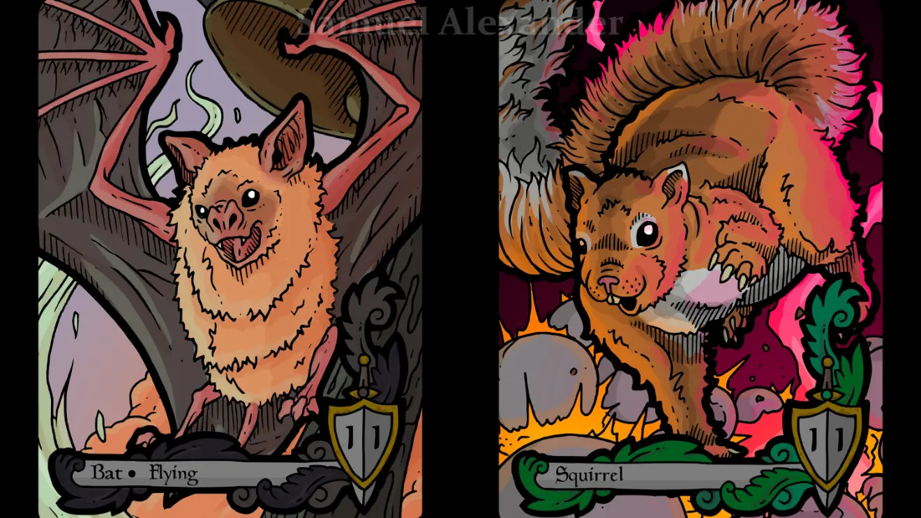
Creature tokens: the essentials
For creature tokens, include:
Name
Creature types
Power/toughness
Any relevant abilities (flying, lifelink, menace, “can’t block,” etc.)
If your deck makes multiple similar creature tokens (two different 1/1s, or multiple Zombie variants), use distinct art or a bold icon so you do not confuse them mid-combat.
Artifact and utility tokens: print the text
For Treasures, Clues, Food, Blood, Powerstones, and similar, the whole point is the ability. Put it on the token.
Also, design for the physical act of play:
Leave space for a die if you track how many “charges” you have.
Make it easy to tap. Tiny circular tokens are cute until you are rotating them like a safe dial.
Copy tokens: embrace the chaos, but label it
Copy tokens are the reason dry-erase tokens exist.
If your deck makes “a token that’s a copy of X,” you have two clean options:
A generic “COPY TOKEN” template with a blank line for “Copying: ________”
A dry-erase token you can update on the fly
Trying to pre-print every possible copy target is an advanced form of self-sabotage.
Double-faced and transforming tokens: plan a method
Some tokens transform or have multiple faces. If you use opaque sleeves, you need a practical way to represent both sides without turning your turn into a craft workshop.
Common solutions:
Two separate token cards, one for each face
A “front face” token plus a reminder card for the back face
A single double-faced token if your play setup supports it cleanly
The goal is simple: no one should be confused about what side is currently active.
Step 4: Emblems should be tiny rule reminders, not mystery objects
Most emblem problems come from one thing: nobody can remember the exact wording.
Your emblem design should include:
The word EMBLEM in a place you cannot miss
The source (planeswalker name is enough)
The full emblem text
Optional: a short “what this changes” reminder in plain language
Examples of useful plain-language reminders:
“This affects all your creatures.”
“This triggers on your upkeep.”
“This changes combat math forever, sorry.”
And yes, emblems are usually permanent in the practical sense. If you get an emblem, plan to see it for the rest of the game. Print it like it matters.
The three classic mistakes (and how to not do them)
1) Tiny text
If you have to pick it up to read it, it is too small. Your token is not a fine-print contract.
Fix: fewer words, bigger font, stronger contrast.
2) Tokens that look too similar
If your Treasure and Clue share the same art, frame, and color, you will tap the wrong one. Not “might.” Will.
Fix: distinct icons, distinct art, or at least a bold label.
3) No plan for tracking
Tokens get counters. Tokens get tapped. Tokens get copied. Tokens get sacrificed. Tokens get blamed for everything.
Fix: build in blank space for dice, and avoid layouts that make tapping awkward.
A quick checklist before you print or finalize
Token name is readable from arm’s length.
Creature tokens show P/T clearly.
Utility tokens show rules text clearly.
Similar tokens are visually distinct.
Copy tokens have a blank “copying” field or a dry-erase solution.
Transforming tokens have a method that works with your sleeves.
Emblems include full text and are clearly labeled as emblems.
You have enough copies for how your deck actually plays (one Treasure token is a comedy bit, not a plan).